The 15 Best Paint Colors for Your Living Room
When it comes to the interiors of your home, few things can make as huge of a difference as the paint coloryou choose for your living room. With so many colors available though, the choices might seem overwhelming when you’re trying to make a decision. Which brings us to the list of the 15 best paint colors for your living room, handpicked for your inspiration and ease. Whether you’re a fan of the soothing neutrals, the dramatic statement colors, or the classics you can count on never to go out of style, these hues will set just the right tone and help your space express your own unique point of view. Keep reading to know more about the shades that will make your living room the heart of your home!
The effects of color on mood and perception.
Color is such a strong facet in feng shui to encourage positivity and to bring a sage space to life, it gives us this power to make you feel things and to make you think things (without being too in your face about it). Warm hues such as red, orange and yellow are known to inspire energy, warmth and excitement, making them great options for active and inviting spaces. Cool colors such as blue, green, and violet, meanwhile, are calm, relaxing and focus-enabled, ideal for tranquil, contemplating spaces. Neutrals (white, grey, beige) can provide balance and flexibility, gently showcasing other design aspects without going overboard. The brightness of a color is equally important: bright, vivid hues are energizing and stimulating, while softened, muted tones soothe and relax. A little background on these psychological impact of these colors will help you decide on colors that not only speak to your style, but can also help boost the mood in your home.
Why Lighting, Furniture, and Room Size Should Matter.
When choosing a paint color for your living room, it’s important to take into consideration factors such as lighting, furniture and size of the room to ensure that the color you choose is a good fit for the space. Lighting — whether natural or artificial — plays a huge role in how the color will look. A light-filled, sunlit room can make colors look lighter and brighter, while lackluster or artificial lighting may make them darker or more muted. Furniture and décor is paramount, because the paint color should coordinate with your sofa, rug and art, and give the room a pulled-together appearance where you – and guests – love being. Finally, room size also plays into how colors are perceived; lighter hues can help smaller rooms feel more open and airy, while deeper shades bring a sense of depth and coziness to larger spaces. Weighing these factors will help you select a color that adds to the aesthetics and usefulness of the room, making it a place you love to be.
1. Warm Whites
Anne Wagoner Design Warm whites are an ever-popular living room wall color, perfect to give your space a comfortable and homey look that complements any style of design. These colors are usually tinged with yellow, beige, or red to create a warm and inviting space. Unlike the harsh, cool whites often seen in institutions and hospitals, warm whites are associated with comfort and vibrancy, which means they work just as well in a traditional home as they do in a modern one. They play well with other natural materials like wood, rattan and stone, furthering the room’s organic appeal, and they act as a neutral canvas to showcase furniture and accents in bolder colors. Perfect for rooms with lots of natural light, warm whites look lovely from dawn all the way through to the early hours and emit a gentle warmth that’s welcoming and classic.
2. Soft Greys
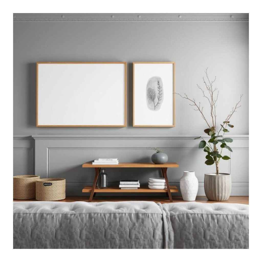
Pale greys Rich, woolly greys are a stylishly versatile option for living rooms, providing a neutral backdrop that feels inviting, but won’t dominate. What these colors have in common are their tints of undertones, many leaning from cool blue to warm beige, accommodating different lighting scenarios and design preferences. Subtle greys are not only calming and gentle but too are easy to useGrey:They are a great choice for minimalist and modern interiors. They work well with brights and neutral tones, and the neutrality also makes them a natural backdrop for layers of different textures, art or statement pieces of furniture. Whether you want a blissful hideaway or a cool, contemporary hideaway, a beautiful greys and gentle lilacs make the perfect combination for a serene, stylish bedroom.
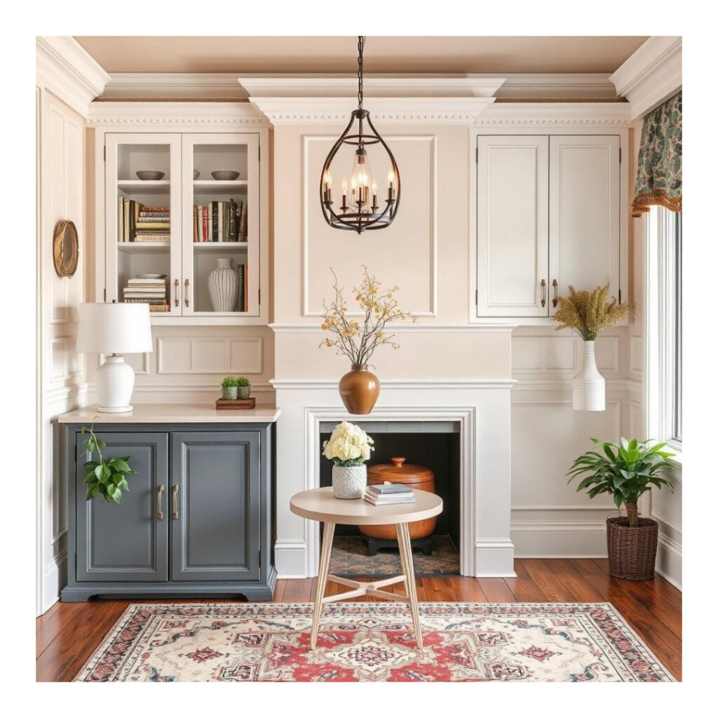
3. Beige Tones
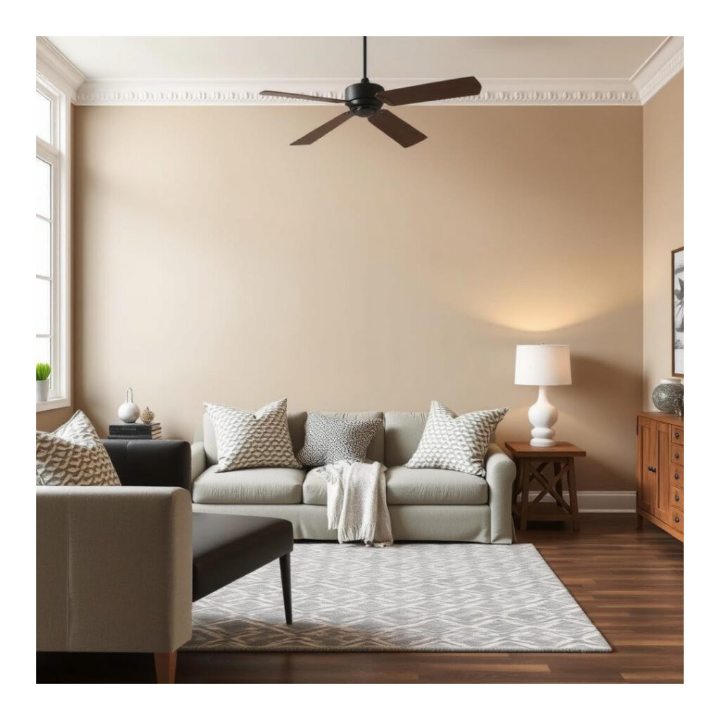
A beige living room is a trend that never goes out of style. With warm yellow, brown, or pink undertones, beige tones create a comfortable, welcoming vibe, while still giving you plenty of freedom to be versatile with design. These colours will work well in classic and modern homes, They can complement or contrast well in both, complemented by natural materials, such as wood and stone, or contrasted against smooth and contemporary furnishings. Beige is soft enough to amplify natural light, which will make smaller rooms feel more expansive and large ones more balanced. And whether you decide to add pops of bold colour for a look-at-me vibe, or prefer subtle and soothing shades of beige layered on top of one another, beige is a timeless tone that will quietly elevate any living room design.
4. Greige Blends

Greige mixes and takes on different aspects, which makes it such a great neutral to use in a living room as it feels really warm, but instead of feeling really warm and orange it has that nice grey tone to it. These cream hues are so adaptable as they subtly change depending on certain light and design styles, it’s what makes your home special, and it’s no wonder that they are a top choice for those are looking for a classic modern feel. Equal parts gray and warm beige, greige is one of the best-loved neutral paint colors around. They look beautiful when paired with cool accents like blues and greens or with warm elements like golds and earthy hues. Greige blends offer continuity as well — whether your living room is dominated by minimalist chic or rustic charm, greige blends form a canvas that help textures pop, natural materials pop and add depth to your living without being overwhelming in the décor.
5. Rich Navy Blues
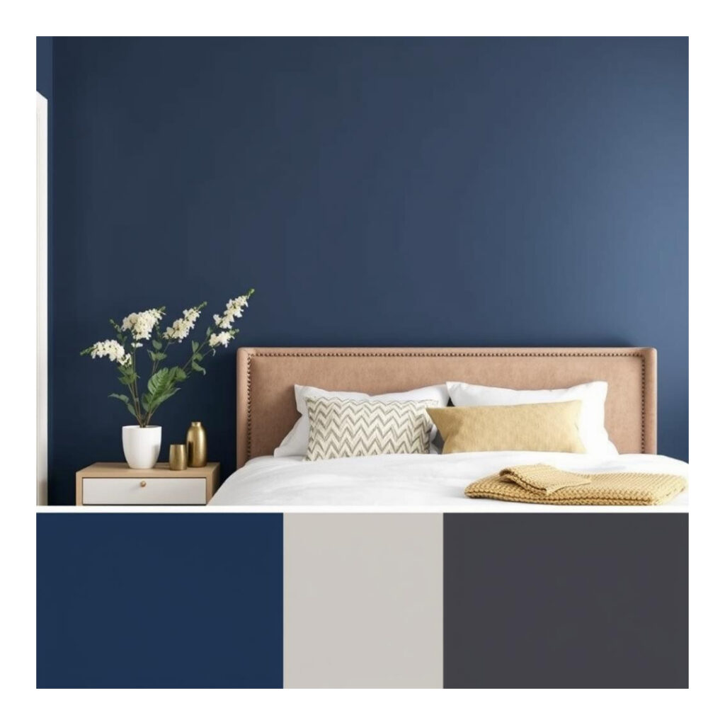
Deep navy blues deliver drama, sophistication, and classic appeal to living rooms. This rich, saturated color carries a calming and luxurious vibe and is ideal for setting up a moody and cozy interior. Navy blues can be used as statement wall or the main color; this hue will breathe depth and personality into a room without being overbearing. They mix and match well with crisp whites for a look that’s fresh nautical, or warm metals like gold and brass for something a little more luxurious. This chameleon shade also complements natural materials like wood and leather, and can be extremely versatile for both traditional and contemporary interior schemes. Whether you’re creating a calm, cozy corner or a beautiful, bold, moody space, a rich, almost-black navy strikes just the right balance of classic, cozy, serene, and sexy for the living room.
6. Emerald Greens
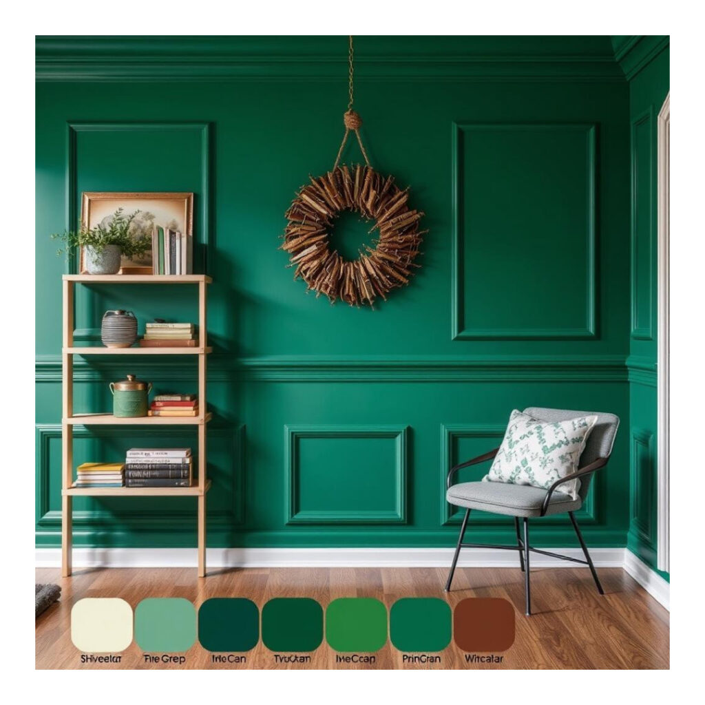
Rich, jewel-toned emerald greens infuse living rooms with a lively and luxe vibe, and when used on walls, this lucious color envelops you and your family in unrivaled comfort. This gemstone shade is a natural one, representing new life and calm while also lending a layer of luxury wherever it’s found. Emerald greens work well with ‘natural’ materials – such as wood and stone – bringing out the organic warmth, but can also be teamed with metallic accents, like gold and brass, to give a more glamorous twist to your interior. As either a colourful accent to a feature wall, or to enhance decor, the effect is lavish, warm and welcoming. Ideal for any classic or contemporary living room, the jewel-toned emerald green makes your living room a haven of chic, while at the same time providing a pop of color!
7. Deep Charcoal Greys
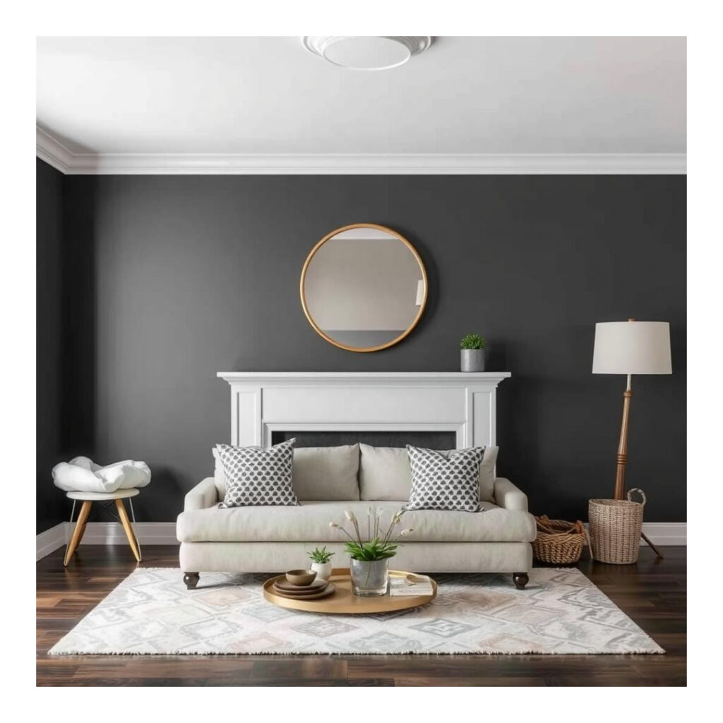
Grey and charcoal living room – Charcoal and deep charcoal grey is the bushman of paint colours. This is a deep and rich hue that has a modern and moody vibe to it that can make your space feel cozy and luxe at the same time. Using charcoal grey as a backdrop to lighter grey, brown or white furniture and accessories, it provides an expensive feel, minus the price tag and the elbow grease required to accent with a stronger colour. It looks stunning matched with metallics, silver and gold (I also tend to throw some natural textures like leather, wood, and stone) because it gives a perfectly balanced contrast without clashing. Best for: Big, well-lit spacesDeep charcoal grays lend depth and coziness without the weight and gloom of black. Whether you want a modern industrial look or sleek, this is the best color to elevate any style you have in your living room.
8. Fiery Reds
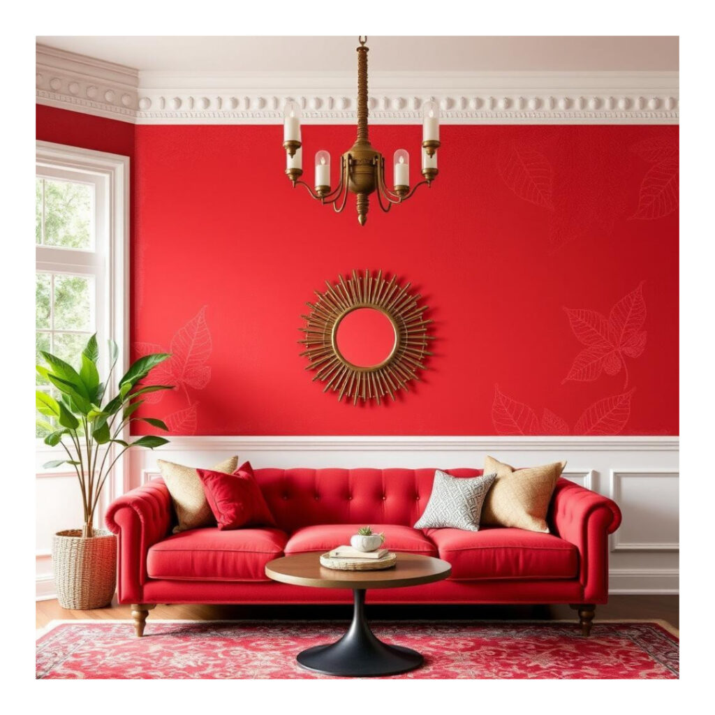
Red-hot reds are bold, sultry, and so full of energy that they’re a dramatic choice for a living room. Color of Substance This bright hue lights up a room with warmth, excitement, and even a touch of intimacy. Nothing screams focal point more than hot red and this is ideal for a feature wall, accessory or even accent furniture in your space. It’s a color that demands attention, but it works with neutrals — soft greys, whites and beiges to counteract its boldness — and adds sophistication. Fiery red can be especially effective in rooms that are designed to be social or active, such as living rooms or dining rooms, where you intend to ignite conversations and a party atmosphere. When used wisely, this color can lend a welcoming and exciting feel to your living room, your room will feel both vibrant and passionate while still keeping a level of sophistication and thoughtful detachment.
9.Terracotta Shades
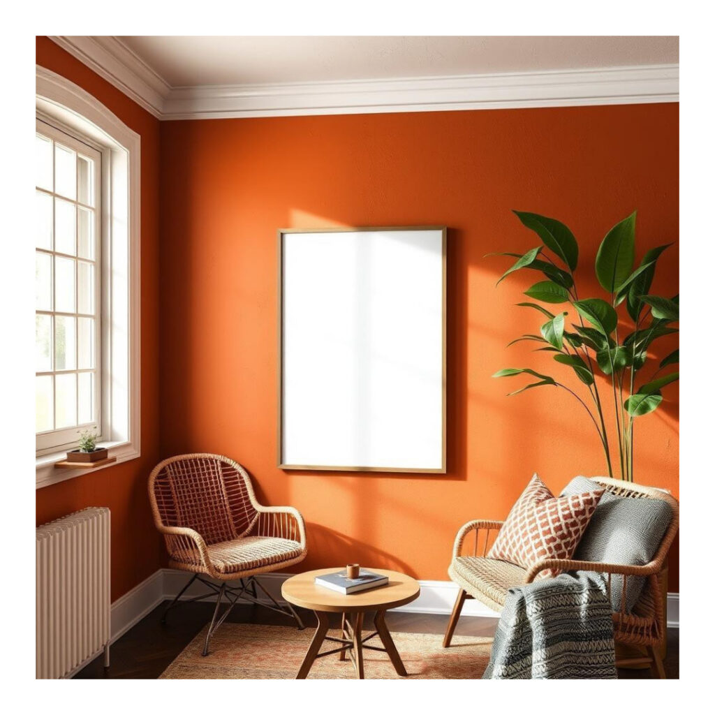
Terracotta hues add warmth, rustic charm, and a touch of sophistication to any living room. This warm, earthy mix of orange, brown, and red are a few of the natural hues of clay, allowing you to create a down to earth, and welcoming ambience. A reddish orange hue that sports grey undertones, this shade of terracotta pairs beautifully in rooms inspired by Mediterranean design, southwestern motifs, and bohemian spaces, providing balance against natural materials like wood, leather and woven textiles. Its warm halfeasy warm vanilla undertone make an easy companion for neutrals such as beige, muted grays and whites, but also work beautifully with greens, deep blues and even golds. Terracotta hues provide depth and personality wherever they’re applied—be it on an accent wall, furniture or decor—and your living room is no exception, thanks to its warm, welcoming vibe that’s ideal for anyone who wants a laid-back yet stylish space with a natural feel.
10. Sage Greens

Sage greens impart a peaceful tranquility when used in a living room with muted, earthy green tones that echo the color of trees and foliage. It’s a soft, greyish green shade that’s versatile for pairing with many different interior styles – from homey, rustic cabin looks to clean, minimal modern. Sage green creates and tranquil and therapeutic ambiance, and is the perfect color for your lounge decor. It looks fantastic with other natural hues like warm woods, terracotta, and soft whites, and it works as a light and airy contrast to deeper shades of charcoal or navy too. As an accent on walls, on furniture, or on accessories, sage green turns your living room into an oasis of subtle elegance.
11. Muted Yellows
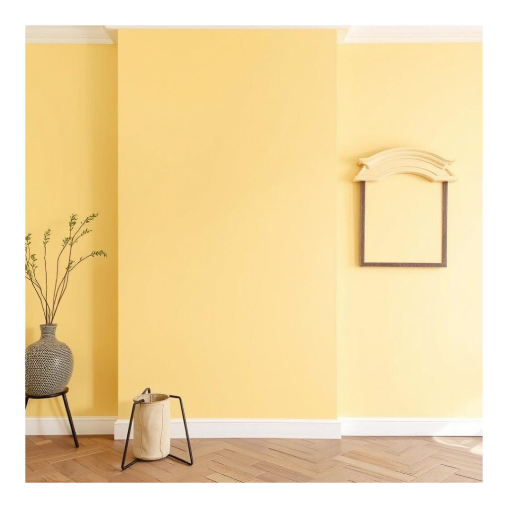
Muted yellows provide a gentle cheerful warmth to the living room that does not turn the volume too loud. While unlike bold candy yellows, these more muted hues add some sunshine to a room, but create a warm, snug atmosphere. With their earthy or golden tinges, muted yellows are ideal for bringing a peaceful, uplifting feel to any space and have a fresh, modern finish. They look great with dusted neutrals or deeper colors (like crusty blues and greens) and can be mixed with minimal effort alongside different styles and pieces. As wall colors, accent pieces or textiles, muted yellows will infuse your living room with a subtle energy, offering both the warmth and light you want in your home without being overpowering or too bold.
12. Blush Pinks
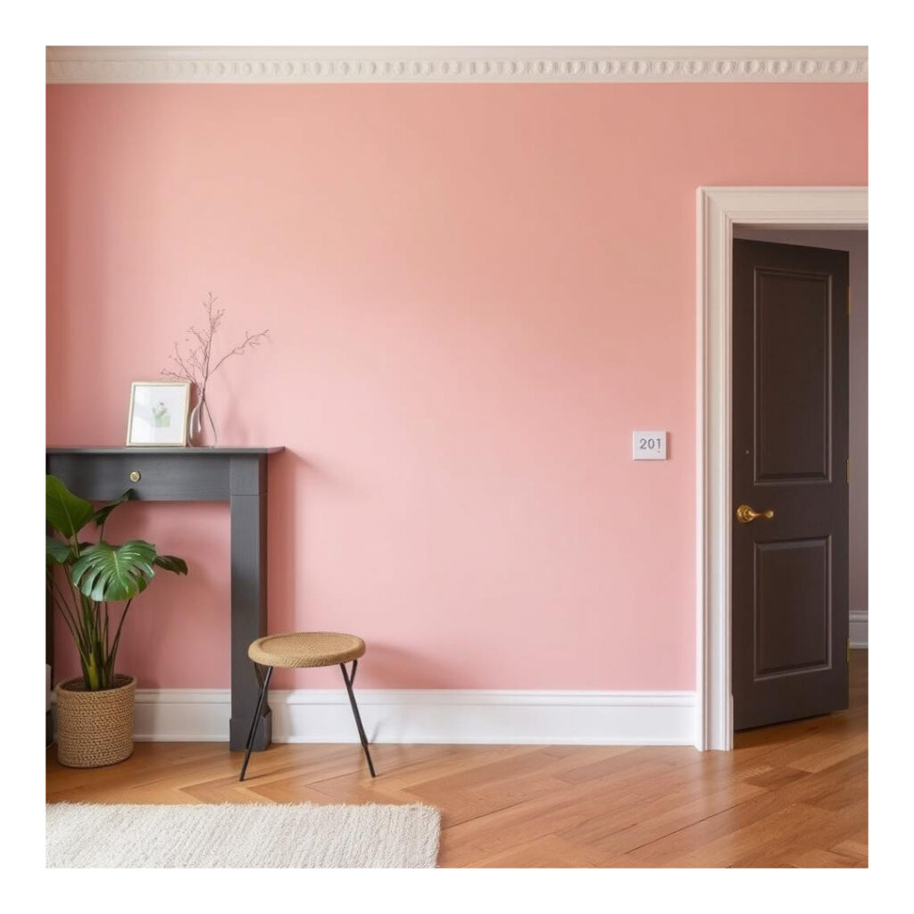
Blush Pink Blush pinks add a soft romantic sophisticated feel to a living room providing the perfect balance between warmth and serenity. The gentle, subdued pink creates a feeling of calm elegance; perfect for any cozy and contemporary environment. Pale pink, especially blush pink, goes well with neutrals such as white, grey, or beige, and also with deeper shades like navy or charcoal. It’s understated enough to work in modern, minimalist spaces, and just enough of a throwback to suit a room with vintage inspired decor. Applied to walls, furniture or throw pillows, blush pink is a subdued color that makes your living room feel calm and cool while the warm tones lead to a hopeful and optimistic living environment speaking volume to your stylish château.
13. Pale Blues
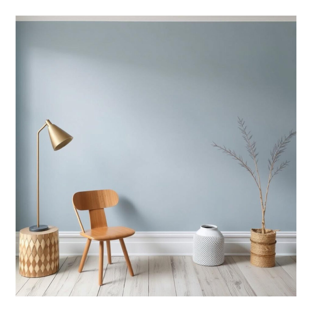
Pale blues create a laidback and breezy feel in a living room that conjures a sense of peace and calmness. This pale blue color, known as baby blue or ice blue, resembled either the sky or the ocean, it is no doubt that it could refresh and relax you! Pale blues are so lovely in small spaces, making them feel open and expansive, and they play well with lots of other colors, too. They play well with warm neutrals such as beige and grey as well as with cool tones like whites or soft greens. Perfect for modern coastal, Nordic or even Scandinavian interiors, soft blues form a gentle neutral for other design features to really pop. Whether in wall or accent form, in fabric or furniture, this color infuses a light, fresh feel to the living room, offering a softened, calm and welcoming environment.
14. Lavender Lilacs
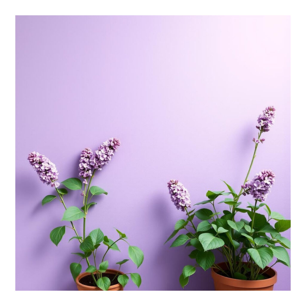
Lavender Lilacs Lavender lilacs offer soft, soothing, and slightly whimsical charm to a living room, providing a gentle pop of color that’s both poised and serene. This soft, delicate shade of purple creates a peaceful and soothing atmosphere. Lavender lilac is a lovely compliment to pastel colors such as whites, grays, and beiges, pulling out hot pink or coral accents or the deeper purple or navy pairs well to create a more natural feel. This soft hue is perfect for rooms with the romantic, vintage-inspired or modern-bohemian feel. Whether sprinkled on accent walls, toss pillows, or furniture, lavender lilacs give your living room a peaceful, breezy vibe ideal for unwinding or entertaining.
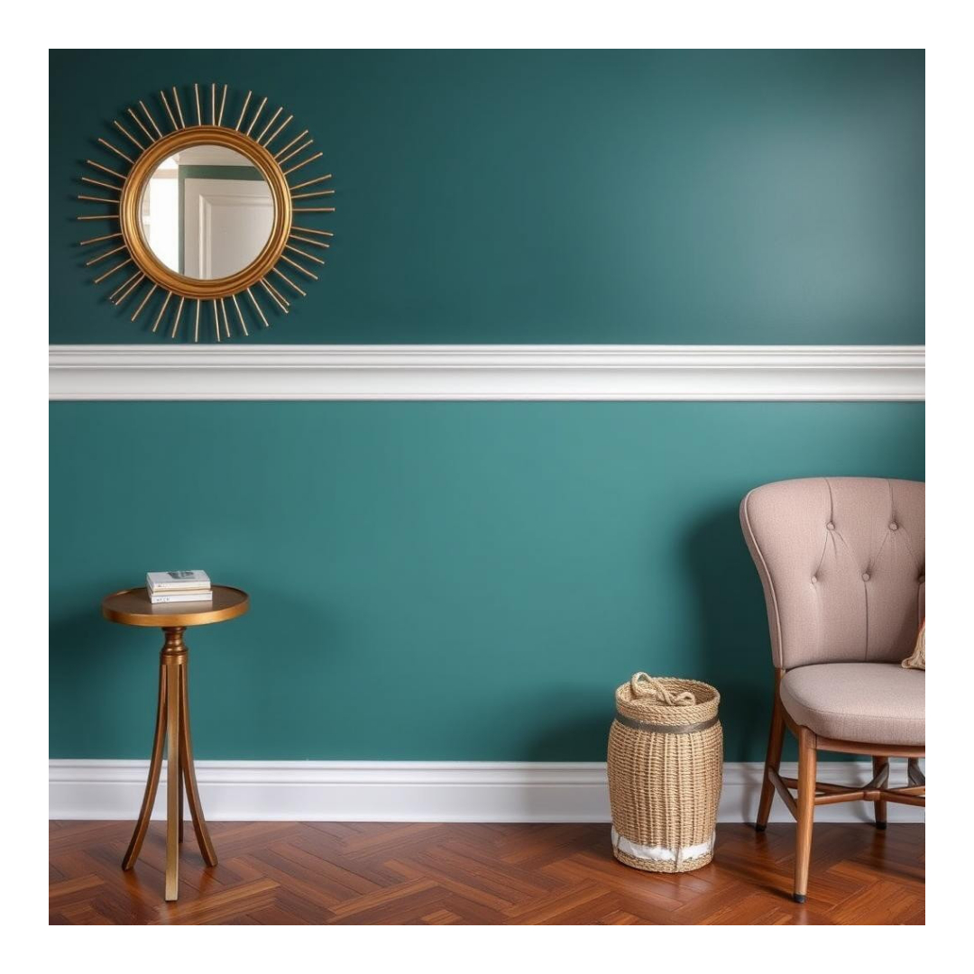
15. Dark Teals or Jewel Tones

Dark teals and deep jewel tones add an upscale look to a living room to create an inviting, luxurious feel. The deep mix of blue and green in dark teal feels luxurious and calming, and it’s ideal for setting up a snug, intimate space. It is also complemented by jewel tones such as emerald green, sapphire blue, and amethyst purple – these jewel tones makes for a striking, regal color palette that gives the room a sense of warmth and vibrancy. These deep, opulent colours look stunning with gold, brass, or silver accessories, adding an extra level of luxury. Whether it’s an accent wall color or a small pieces of decor or textile, a dark teal or jewel-tone can make a big impact, making your living space a rich, serene domain known for sophistication and personality.
How to Select the Perfect Paint Color
Picking the perfect paint color for your living room may be a fun but challenging task. To help inform you, here are a few things to know:
Mind the Light: The way the light hits a color, whether it’s artificial or natural, can make a big difference. Try out your colors in various lighting conditions to observe how the colors look at different times of the day. Lighter hues are usually more at home in rooms with lots of natural light, and darker colors can add variety and coziness to darker spots.
Consider Room Size: Lighter paint bestows the feeling of space and airiness, but it can also make a small room feel more cavernous and expansive. Dark hues will make large spaces seem more intimate and cozy. Choose pale or neutral tones if your room feels small; if your room is oversize, deep colors like navy or charcoal can make it feel more intimate.
Match Your Furniture and Décor: Your wall color needs to go with the furniture and other items in the room. For all you neutrals, you can try out bolder colors. If your furniture is already colorful, you may want to stick to more muted or neutral wall colors.
Test the Color: Be very sure before you paint your walls. It’s a great way to see how a color looks in your space, especially given the way undertones can change, depending on the light and other surrounding colors.
Set a Mood: Consider the type of mood you want to capture. Warmer colors such as reds and yellows can make you feel energized and warm, while cooler shades such as blues and greens can make you feel relaxed and peaceful. When choosing a hue, consider what vibe you want the living room to exude.
Opt for a Timeless Palette: As much as we all love to experiment with trendy colors, it’s key to have a few shades that will last the test of time. Neutrals, lighter greys, even earthy colors like sage and beige often look good one can one year to the next.
Match The Rest of Your Home: Your living room’s color should match the rest of your house. If you have an open floor plan at your home, you don’t have to worry about stopping and starting colors throughout the house, you can just make sure the colors flow easily into each other.
Keep these easy tips in mind while you choose the paint color for your living room, and ensure that your living room wall color reflects the personal and relaxed style you want in your space.
Final Thoughts
Seeking out the perfect paint color for your living room is a transformative step towards uplifting the heart of your home’s colour palette. Whether you prefer soft neutrals, bold jewel tones or soothing pastels, the right color can create an atmosphere, transform a space and express your personal style. Keep in mind how much natural light your room gets and how big your room is and what colors your current furniture is to find a color that will complement your living room’s vibe.
So with that inspiration and those tips, it’s your turn to get going! Try some samples, trust your gut and have fun! If you’re ready to bring your dream to fruition, grab your paint brush and design the living room you feel most at home in. Happy decorating!